


The mission of the Société de transport de l’Outaouais is to provide residents of the municipalities in its area, which includes the Gatineau urban area as well as Cantley and Chelsea, with a reliable public transit system.
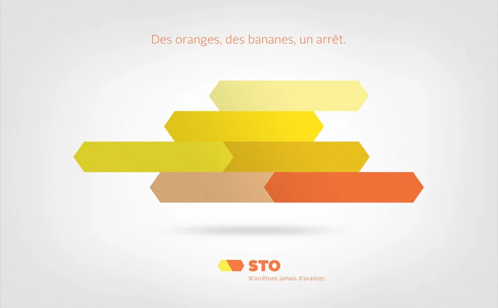
Modernizing STO’s image was the primary focus of the rebrand. The logo is simple, signifying one of the main goals of public transportation, and emphasizes the idea of continuous movement with arrows pointing both to the road taken and the road ahead.
The fresh and modern palette highlights STO’s commitment to sustainability and making all their transportation sectors work together in a harmonious way.